Award Winning: Deloitte Digital Award for Best Research & Graduate Institute Design Ireland Commended for Interaction Design & Visual Communication : Design for Digital
User Research, User Experience Design & Brand Identity & Website Design / Kingsmoss Gospel Hall
Forgetmenot : Easing the pressures of dementia care
Problem
To cut to the chase, informal carers of dementia are extremely undersupported. In 2019, it was recorded half of the informal carers in the UK experienced depression, when the care hours where reaching 1.34 billion among carers in the UK per year.
However, due to COVID-19, the care time has only increased dramatically, “ ’Exhausted’ family and friends spent 92 million extra hours caring for loved ones with dementia since lockdown.” In total, the Alzheimer’s Society support services have been used over 2 million times since the beginning of lockdown. The need is rising and rising, parallel with the pressure to step up and care for your loved ones more than you can handle. 45% of family carers felt the level of care their loved one with dementia needed was more than they could give. As a result 14% of these carers disregard health appointments for themselves and instead adhere to their overpowering caring responsibilities.
There is a real need to support carers, mentally, physically, and emotionally to decrease the number of people suffering with depression, and to ensure they don’t increase the risk of developing dementia themselves down the line.
To kick off the project, I had an initial call with a member of Kingsmoss Gospel Hall to gather all the necessary details for the website and brand revamp. I began with the brand identity design, which then set the tone and style for the website.
Solution
To start I spoke to real users, informal carers who where or still currently are caring for people suffering from dementia. I carried out a survey to assess the real need and the seriousness of it. This survey helped form design decisions based on the feedback given, but also was the basis of other conversations forming on the side. I was able to talk to people about their struggles, if they thought there was enough support out there for informal carers, and what they would find useful in an application to assist them whilst caring.
I personally care for someone with dementia with multiple other women, so I not only applied my own thinking but I asked for their insights too. I have experienced firsthand some of the struggles when multiple people are caring for someone when neither of the carers live with the patient. So again, I applied these insights (backed up by others to avoid a biased approach) to the features and flow of the design for the first set of wireframes.
I combined these findings into empathy maps, and user personas, forming from those user journeys and user flows to start building the first blocks of my application.
Key Thinking: What do they think is most important? How could I make sure and design their tasks in a clear, busy-free space? Where could I add delighters? Is this the best way to display this information?
From these findings I settled on these main features :
Care Board - The main hub of the app. The caregiver will come here to cross off all the tasks of the day that they are scheduled to care for. They can complete tasks, add new items (appointment, medication, meal time, etc.) & are able to see what the day before and after the current looks like.
Care Reports - The carers can get generate reports of previous care sessions, depending on the date chosen by the carer. Other carers of that patient can view the insights of how the last care session went & if there are any major updates/changes needed to the care routine.
Notifications / Messages - A place where the carers can all communicate.
Patient Profile - The patient's hub. Here all their data is stored, carers associated with them (with the ability to add or remove carers), view medication, meal times, DOB, etc.
Carer Profile - This is how the carer will navigate between each patient they are caring for, adding or removing patients, etc.
Outcome
Application
Forgetmenot. The digital solution to easing the pressures of dementia care.
A mobile application designed to manage care tasks, facilitate communication between carers & ultimately take the pressure off the informal carers. Combining user insights, statistics from online resources & feedback as to how the app could better perform - I have come up with the solution of a clean, simple user interface to allow for easy navigation & reduce stress for the informal carers as they stay on top of each task. Giving the carers a little time back for their own families, giving their mental health a wee deserved break.
Brand
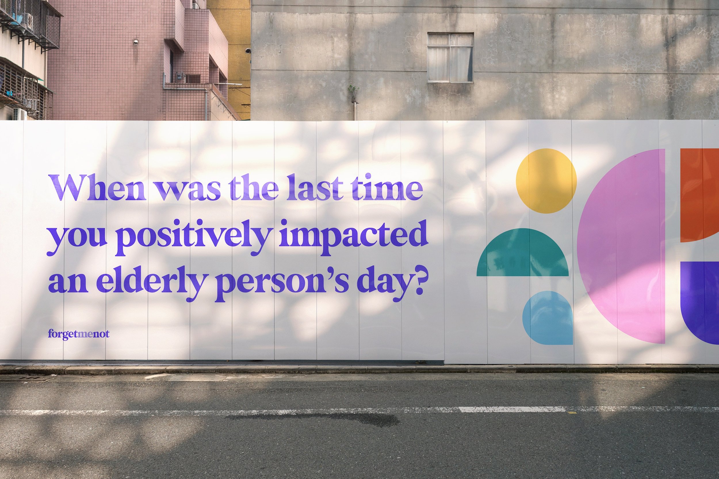
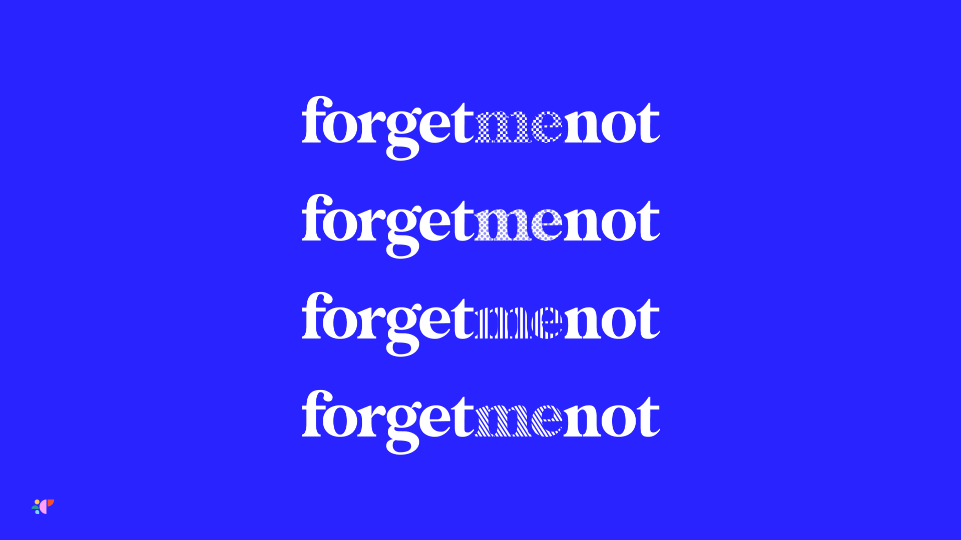
The app is accompanied by a meaningful brand that has been curated from insights of research into dementia and how colour is crucial for effective care of a dementia patient. The brand’s vibrant colour palette is representative of this, as well as the shapes complementing the brand, each with its own significance. The variant logos, distinguished by patterns are representative of everyone's unique build-up and story as to how dementia has impacted their lives.
Competitor Analysis
User Research: Surveys, Focus Groups, User Interviews, Personas, Empathy Maps
Discovery & Feedback Workshops
Information Architecture & Site Maps
Wireframes
User Experience Design
Prototyping in Figma
User Interface Design
Brand Identity & Logo Creation
Responsive Web Design
Usability Testing
POC Creation with Verticode


